


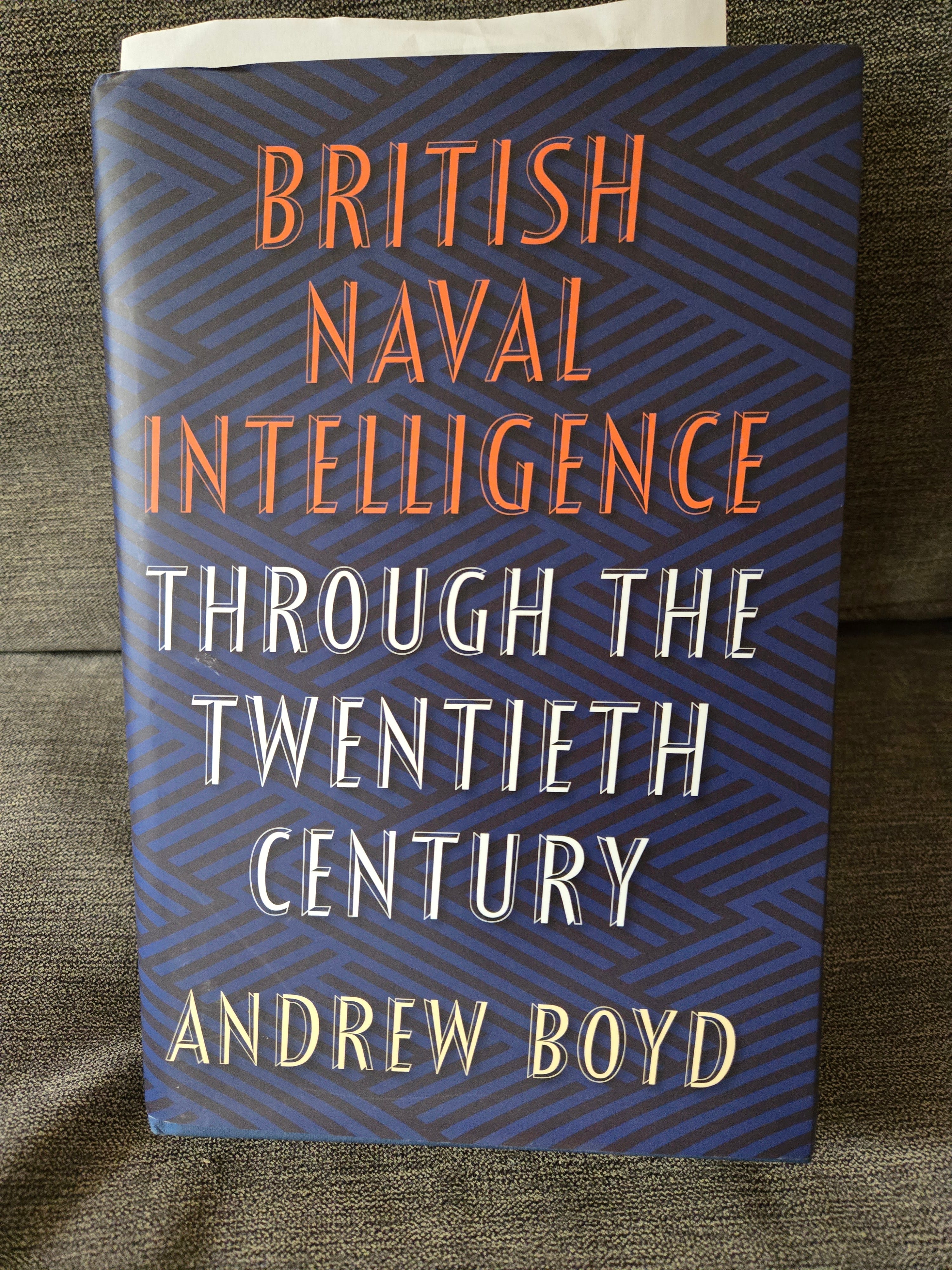
A review of a bad book *cover*
British Naval Intelligence Through the Twentieth Century by Andrew Boyd (great book!)

To be clear, this is a fantastic book. It was expensive (couldn’t get it used, couldn’t get it as an e-book, couldn’t find it in a library, finally ordered it through Politics & Prose), and totally worth it. First off, it’s an enormous tome about the history of British intelligence that isn’t written by Christopher Andrew—he’s great, too, I’m just saying, it’s nice to mix it up. Second, it’s a scholarly work, a very dense read. I’m usually able to fly through a book, but I’m only 80 pages in, and I can’t skim-read. I’m soaking up every detail regardless of whether I need it for my scholarship.
In fact, it’s such an important book for me to read that I’m going to take a hiatus from writing more scholarship until I’ve read at least half of it, which will take me from the 1880s through the 1930s. I bought it because I realized that I knew next to nothing about the history of British naval intelligence, or the history of the Royal Navy, or…for that matter, the U.S. Navy, or naval strategy, or navies generally. I’m a former U.S. Army officer. My attitude towards the Navy is basically

Naval warfare is a huge blind spot for me. I don’t even understand how one learns naval strategy or naval history. I walk battlefields. I’ve walked on the beaches at Normandy. I’ve toured where the Battle of the Bulge took place. I’ve watched the Washington Crossing the Delaware and various Civil War reenactments. What do you navy people do to learn about, say, the Battle of Midway? Go out in the middle of the ocean and stare at it?
I bought the book partially because I’m entertaining a theory that the United States relies on SIGINT to the exclusion of other collection disciplines because of the British naval influence. It’s clear the French had a huge influence on U.S. military intelligence during World War I, because they were the masters of land warfare for the Entente. But the British Royal Navy might have had an earlier influence. As I noted in this post:

British naval officers were being suspiciously nice to the American naval forces in Hong Kong leading up to the Spanish-American War. This is not to say they were sharing intelligence with the Americans yet, but there might have been an early bond formed between the two navies that helped lead up to the seminal decision to start sharing SIGINT at Bletchley Park prior to World War II, which in turn led to the arrangement known today as the Five Eyes. Navies are sort of inherently international in a way that armies are not.
Eighty pages into this book, I can see that SIGINT was important to the Royal Navy very early on, since they were pioneers in radio communication and also carefully guarded their undersea telegraph cables. The SIGINT outfit known as “Room 40,” which intercepted and deciphered the Zimmermann Telegram, was constituted under Director of Naval Intelligence Reginald “Blinker” Hall (which I discussed here):

British naval intelligence also had operatives in Mexico countering German SIGINT and HUMINT operations, including the Black Canadian double agent William Gleaves, whom I talked about here (towards the end of the post):

The Royal Navy, supported by its SIGINT and HUMINT, was in turn hugely important to the British Empire, to Britain’s ability to basically starve Germans to death during World War I, and more broadly, to Britain’s sense of national identity. British naval intelligence was probably also important to the development of IMINT and GEOINT in ways I’m not sure I understand; I don’t have a firm grasp on how you map things and navigate in the middle of the ocean, much less find other ships (I played Battleship as a kid. That’s about the extent of my understanding). So, I really do need to absorb this book for a while and determine to what degree naval intelligence has been a missing part of the composite picture I’m trying to paint.
But let’s talk about this book cover design.
Is the message supposed to be, “I’m such a serious scholar, I can’t be bothered with book cover design?” If so, I’m on board with that; no need to be sensationalistic in a way that detracts from the seriousness of your work. But does that mean the book cover has to be physically painful to look at? What is this demented argyle wallpaper all about?
And the font—is that Comic Sans? Why does it look shaky? Is that an optical illusion? Nothing about British naval intelligence in the 20th century should appear shaky.
I know another serious scholar, my ukulele teacher, who teaches at American University and is a big-league nerd about music theory (I often tell her when she’s going on about chord construction that she’d make a great cryptologist, as many musicians do). She wrote her Ph.D. thesis on Leonard Bernstein’s Young People’s Concerts and then turned it into a book. Got almost zero support from her book publisher, so she basically designed all the graphics. Somehow it occurred to her that a book about Leonard Bernstein should probably have a picture of, say, Leonard Bernstein on the cover.

Conducting one of his Young People’s Concerts, even.
Now, is there any one person’s photo that exemplifies British naval intelligence through the 20th century? Probably not. As you might imagine, Winston Churchill is in the middle of everything, because he’s always in the middle of everything—I’m up to the part where he becomes First Lord of the Admiralty in 1911—but there’s no reason to put him on this book cover when he’s on so many others. But how about, I don’t know…a ship? An anchor with some winding rope or something? There’s an entire genre of women’s fashion called “nautical,” and yet there was not a single evocative image or flourish that anyone could think of for this book?
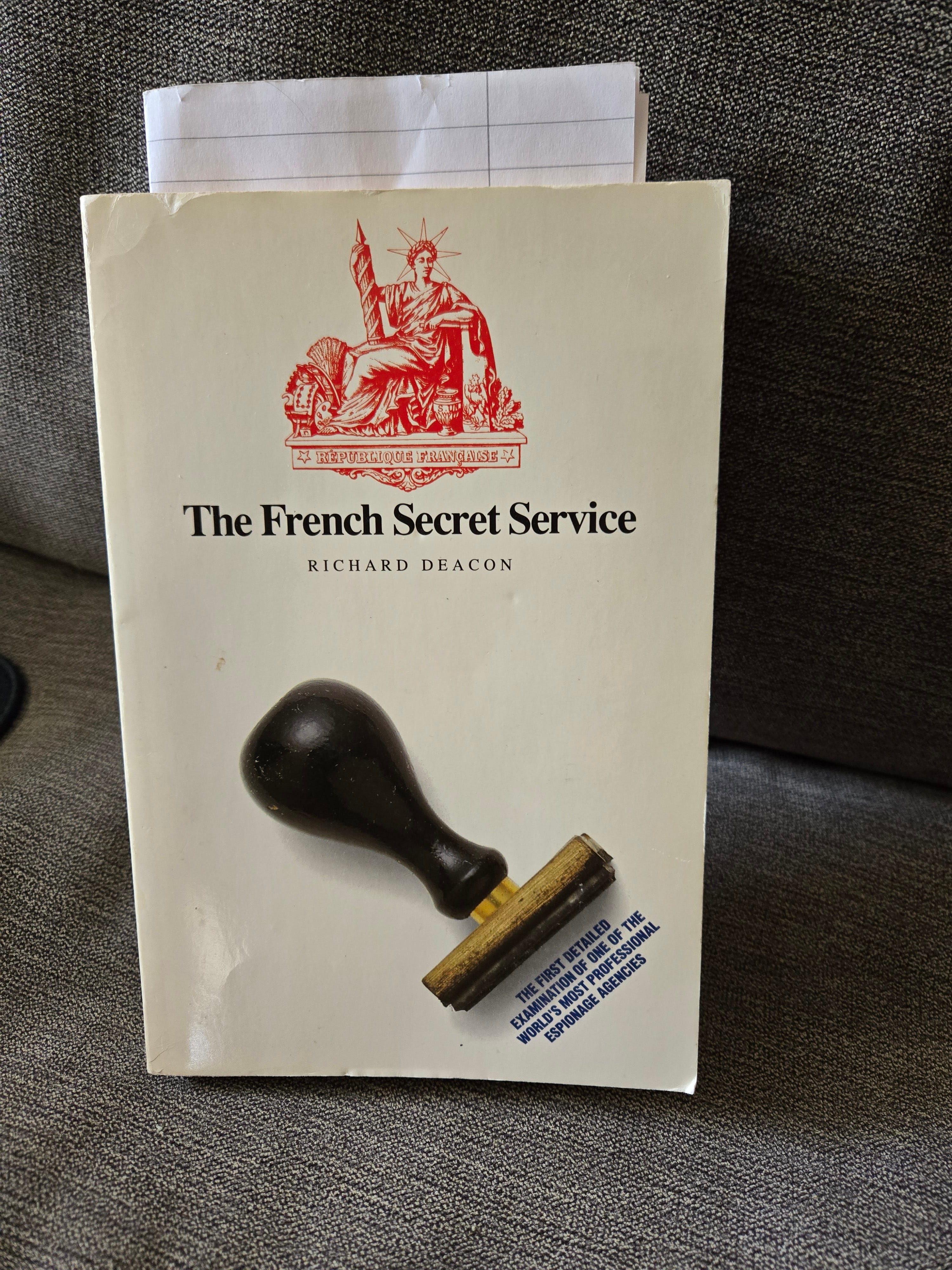
So then I thought, maybe bad book covers are some sort of time-honored English tradition, you know, like bad teeth. But Richard Deacon, publishing with Grafton Books in 1990, could at least come up with this:
But let’s even assume that there’s no graphic or symbol of any kind that could possibly have conveyed British naval intelligence through the twentieth century. The cover still could have had a color scheme and a font that looks stately. Here are some of the other big tomes I own about the history of intelligence.

Tim Weiner, the American, actually has the least attractive color scheme of the bunch. So we know that the British are capable of producing decent book covers. One color background, one or at most two colors of font, and we’re done. These are all aesthetically acceptable, if not downright pleasing. That’s a particularly nice shade of red over there on the right. You could do an accent wall in that color.
Meanwhile, what’s going on here?

Black, blue, orange, white, and then a kind of washed-out yellow for the author’s name? Are these someone’s school colors? If so, they should change them. And how about just one color for the backdrop? Since the book is about the Royal Navy, I’m thinking…I don’t know, NAVY??
I hate to make such a big deal out of this, but the fact is, this book is both a fantastic and unique work of scholarship and something that I’m going to be reading for quite a while. Which means it’s going to be lying all over my nightstand, the living room couch where I’m taking all these photographs, the dining room table so I can read a few pages over breakfast, in the car when I’m not driving, etc. My wife is on my case enough as it is for leaving all my crap lying around the house. Is it too much to ask that the book cover design not itself constitute a sort of domestic ambient pollution?
Eventually I got curious: What does Andrew Boyd look like? Aren’t you curious? How old is he? What kind of a person publishes a book this thorough—I mean, this reflects years and years’ worth of original source scholarship, plus interpretation of indirect references to missing intelligence reports that would only be possible if the researcher first had a grounding in British naval history—and then lets someone put a book cover on it that looks like this?
Or does Dr. Boyd actually like the book cover? Maybe this black-and-blue design was modeled after his favorite sweater. I eventually broke away from reading about Winston Churchill, flipped to the inside jacket, back cover, where you usually find a profile of the author, and…

Dammit!
Anyway, the book with book cover was produced by Seaforth Publishing, as you can see. Make a note of that if you’re ever looking to publish a book.
And if you really are curious now what Dr. Boyd looks like, I eventually found him here. Decent teeth.